Wednesday, 19 February 2014

You're so full of Character(s)!


Does anyone know what the going rates are for paying people to come up with blog post titles? Asking for a friend...

As the title suggests, this post is gonna be filled with a load of character designs. Most of these are from my sketchbook so they aren't going to be the best quality because I'm silly and didn't scan them. I hope the images aren't too difficult to see, though! 

I'll start off with the sketchbook pictures and then move onto digital stuff. Here they are:


The top one is okay because I got to zoom in on the page, the others not so much. I'm sorry. D: I should have some of these digitalised before next week's entry so for now I'm afraid clicking to enlarge the image is the only way to see them clearer! 

Next up is the digital work, luckily I didn't have to take pictures of these ones:


I finally got the lineart for the different Grumpy Bag expression/poses done. This was fun to do so I may do more. :D


As mentioned last time - we started working with Mudbox and I think it is AMAZING. This was my first attempt at creating a rock. They're all the same just from different angles. It was so much fun and I'm really looking forward to giving modelling some of my characters a go in it.

Here's an Oddish that I drew because someone posted that spread Pokemon across Facebook thing and I wanted to try it. :D


Finally here's Clide, you maaaay recognise him from one of the sketches above...

He was suuuper fun to draw and I'm quite happy with how he turned out, so look out for more pieces based on him in the future. :)

That's all for this entry, thanks for reading if you did and have an awesome week! 

(~^-^)~

Friday, 7 February 2014

*blows away cobwebs*


*gets eaten alive by giant hoarde of tiny spiders*

I'm starting to see a trend with this - I come back for a little while and then I disappear and try and force myself to think of some kind of pun to make up for it. I don't have one this time, I'm sorry. :(

It's kinda obvious that there's been a bit of a while between the time of my last entry and now so I'll try and get things back up to speed and explain what has been going on. I also have some art to show too, gasp! 

I started semester 2 of my second year at uni. So far I've really enjoyed all of the projects we've done/had ongoing but I have a pretty big amount of personal stuff going on that is screwing me over every chance it gets, so things aren't going as well as I'd like to say they were.

I am working on it though and I'm determined to get back to wanting to do more than sleep, so hopefully that'll work out. :D 

Now that the boring bit full of excuses is out of the way, onto some art:


Here's Grumpy Bag. He's a design that popped into my head and just wouldn't go away so I figured I'd try and draw him. As you can tell by the lower half he isn't done yet but I thought he was done enough for me to be able to show you, so here he is. :D

I also did some more studies of him that I plan on cleaning up, so here's the sketches:

So blue, whoaaaaa.


Onto some 3D stuff now. We got the chance to start messing around with Specular textures and that kinda thing with Maya and UDK and I'm not gonna lie, I'm kinda fascinated by it. :'D Some of these pictures will probably look kinda boring but I don't care! They're cool to me. ;-;

Here's the first test that I did (no texture):


So shiny. @u@ The next one is a bit more interesting, I promise. Here's the texture I made for it:


I should have worked on it longer but I think it came out okay for the 10 minutes I spent panic-painting it. I have to make another one so I'll be sure to spend more time on that. Here's what it looks like in UDK with a Normal and Specular map applied:


GOSH SO MAGICAL.

This week we're starting Mudbox which so far has made me make seal noises of joy because I'm easily amused, so I'm looking forward to that. Hopefully I'll have something to show of it in the next entry. 

Thanks for reading if you did and have an awesome week. :D 

(~^-^)~


Wednesday, 8 January 2014

Happy New Year!


Very belated, but Happy New Year! :D I hope you had an awesome lovely time filled with happiness and too much food. 

Here's some stuff that I've done recently:


This is an Orc type... thing that I made. I wanted to completely redo our DOTA character project (for anyone who needs a reminder of that project you can find it here) because it was awful, so I'm hoping to make something that isn't AS bad as the first one.

I also really liked the top lineart that I made of him, so I decided to colour it. Here's two versions that I did (one with coloured lines one without):


It was a tonne of fun to do and I can only hope (pray) that the Maya model I make of it will look somewhat similar.

Speaking of the model, here's what I have of it so far:


He's very blocky at the moment though I have a fair amount of tris left that I can use to fix that, and he doesn't have sunglasses unfortunately - I'm going to make his eyes literally stand out and hopefully it'll look as cool as what I have pictured in my head. :D

Then finally here's a digital painting I did of a singer called Kim Ryeowook from the group Super Junior:


I shouldn't really have painted this considering the other work I needed to do but I felt like I needed to do something like this to try and wake myself up a bit. I've been beyond lazy recently and feeling very burned out, so I figured it might help. Only time will tell. :)

That's all I've got for this post, thanks for reading if you did and I hope you have an awesome week! 

(~^-^)~


Wednesday, 18 December 2013

Plinky Plonk XMas!

I'm so so excited and happy to be able to FINALLY make this blog entry! :D We've been waiting a few weeks for Apple to approve the app and now that it's out we finally have the go ahead!

By we I mean Bev Bush (Games Design Course leader at UCLAN), Hannah Spikings (A fellow, extremely talented, student) and Jane Cull from FoCul who made the whole thing possible. They're amazing people so I'd suggest clicking their names and checking them out. In a non-creepy way. :D 

Plinky Plonk is an iPad App that helps teach children how to play the piano and allows you to earn coins to spend in the game's shop. We revamped the game from its previous version and added the Pond Scene, which you can build up by unlocking characters with the points that you earn.

I'd tell you more but I don't want to give everything away, so please do download it if you can - it's FREE! :D Here's a link to the game in the app store to make it even easier for you to get to it.

Here's a few screenshots of the game to show you a bit of what it's like:


And then to add to it a little more, here's some larger versions of a couple of the characters I made for this version:


There'll also be a non-Christmassy version of the app released at some point soon, so look out for a blog post about that when it happens! :D

If anyone wants to help spread the word that would be amazing, and thank you so much for reading and playing if you did! 

(~^-^)~


Wednesday, 11 December 2013

Very Late Blog

Before I start I just want to say that I'm sorry for how late this blog post is. I've had some personal stuff going on the last couple of weeks that has made me extremely tired and not do close to as much work as I should have done.

I'm hoping to get back on track soon but for now here's what I have to share.

The treehouse scene I've been making in Maya is mostly done, I just need to finish the texturing and put it into UDK (which I'm going to get done tomorrow). 

The texture maps are all over the place at the moment so I'm just going to show some pieces that are somewhat finished rather than the whole thing:


The top piece is for the top of the trees while the lower two parts are various bits of tree bark.

Then here's the full map for the tree trunk (with a few gaps):


I'm not sure how big it'll be in size but if you click it you may be able to see some of the details.

Here's some shots of the scene itself without a texture so you can see what it looks like on its own:


The whole thing is made up of 13 different pieces with 5 of them being reused.

Here's what it looks like with the unfinished textures:


I really really don't like the tree tops. I think that they're too round and the texture looks awful on them, so I'm hoping to fix that over Christmas Break. 

I also had to model my level in Google SketchUP, so here's a look at that (warning, it's terrible):


I have more to it that matches up with the sketch some more but this is the general idea.

Then to finish off on here's some pancake cat:


That's all for this week. Thanks for reading if you did and hopefully things will be back on track soon. 

(~^-^)~


Monday, 25 November 2013

Tasteless Treehouse


This week I had to do a presentation for my Contextual Studies module, so here's the title page for that. I'd share the others but this is the only one that actually includes any artwork that I made:


Looking at it now there's a lot of things that I could have done to present it better but I'll know that for next time.

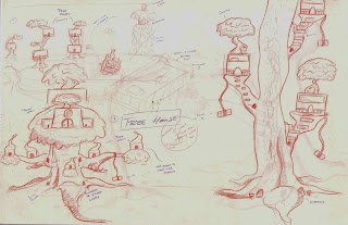
Next, here's some concepts I did for our current project:


This one bothers me a bit because of how big the tree trunks are compared to the amount of leaves.  e_e I'm going to fix that when I make the models but the sketch still bothers me a little.

And here's the second one:


Note: I can't take credit for the larger purple writing or the shading on the bottom left tree, that was one of my tutors. The tiny writing is mine. ;>_> JUST SO YOU KNOW.

I also have another page but I'll have to show it in next week's entry because I was silly and didn't scan it and I don't want to take a bad photo of it while the other two look somewhat presentable. 

Then finally, here's some art I made to display the emotions that Downton Abbey has caused me this week. I made the (wonderful) mistake of deciding to finally watch it and it has already broken my heart several times. Just 2 seasons to go until I'm caught up... :( </3


Have an awesome week and thanks for reading! 

PS Anna and Bates are my favourites. I don't think anyone really wanted to know that but I just wanted to share.

(~^-^)~


Friday, 15 November 2013

Break Blog

This is the second week in a row that I've made a blog in the studio, just this time it's during my lunch break~
I finished the Spider Plant this week and put it into UDK. The original plan was to remove his face after I did some more of the painting but I decided in the end that I'd keep it because he looked kinda weird without it. D: 

Here's some shots I got in UDK:


Needless to say (I hope) the images are of the front/side/back of the model. I would have liked to try and make something for him to sit on other than the default scene but unfortunately I didn't get to do that. ): May have to be something I do in the future. :)

Other than finishing my Spider Plant the other thing I've been doing this week has been the UI of an existing game concept I had.

There's probably only about 2 people (me being one of them) who remember my 'Freshly Tweezed' concept, so for those of you who don't this will probably be kinda confusing until I can add something to this blog that shows more of it.

Anyway, I chose it for my project and so far I only have filler images to test my PowerPoint, so they aren't that great but I'll show a couple anyway:


As mentioned these are just filler images so they only took about 2 minutes to make, I do plan on making way better versions that'll be included next week. :D 

That's all I have for now, thanks for reading if you did and I hope you have an awesome week! 

(~^-^)~